I really, really, really, really wish I had this blog thing going when I moved into this loft just over 5 years ago. Man, the amount of awesome before & after content! But luckily there are still a few projects waiting to be done years later for me to share with you. And who are we kidding…I’m starting to get tired of things I did 5 years ago so you’ll probably start to see makeovers of the makeovers soon.
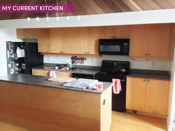
But first, the kitchen. I can say that I don’t hate my kitchen. In fact, I feel pretty spoiled to have such a large kitchen living in an loft/apartment and the layout is great. But the beach wood cupboards and horrible cheap counter tops have been killing me since the day I moved in. I live in a historical building that was turned into lofts in 1999, which can be seen looking at my kitchen.
Unfortunately I don’t really have much of a budget but I think I can give this kitchen a pretty decent makeover with some serious bargain hunting (my speciality) and a few cosmetic updates. Ok, so I threw a very expensive designer fridge on the wish list too but hey, that’s what mood boards are for. I mean, for me, looking into sites such as https://www.bradsapplianceco.com/ to get in touch with a repair company if my fridge fails one day, in comparison to buying a designer fridge is more realistic. But who knows? Maybe one day.
What do they say, if you put something out in the universe it will come to you? I’ve seen some amazing designer kitchens Manchester that I’ve used for inspiration and I really wanted to make my kitchen look as stylish as possible.
I’ve been pinning a bunch of stuff over on my Kitchen Pinterest board for awhile now and you can definitely see my style (hello colour!) and what I’m thinking but it’s still a little all over the place. I went through it and saw a few really obvious themes that I’m loving and using that as a starting point.
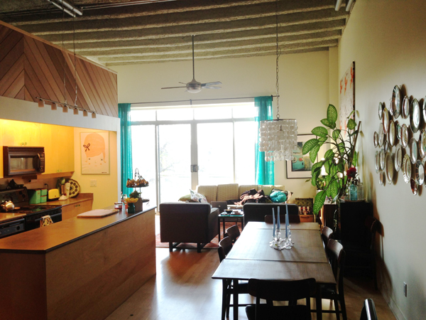
Just to remind you, this is an overview of my loft so you can see that it’s open concept and already filled with lots of colour, collections and vintage inspiration. You can see a few more details, like the colourful plate wall directly across from the kitchen via the latest Covet Garden Home magazine if you want an even more detailed picture.
So as I mentioned, budget is limited but aside from this designer fridge (approx $4000) which can realistically wait until later I think most of these ideas are very doable on a budget for maximum impact. I should mention that I do own this loft but it’s still smart to be budget-friendly when doing condo renos because unfortunatel, they don’t go up in value as significantly as homes, especially when you’re the third owner. Of course, if you’re going to perform a renovation of your own, you will want to find out more about what precisely your home insurance covers before going ahead.
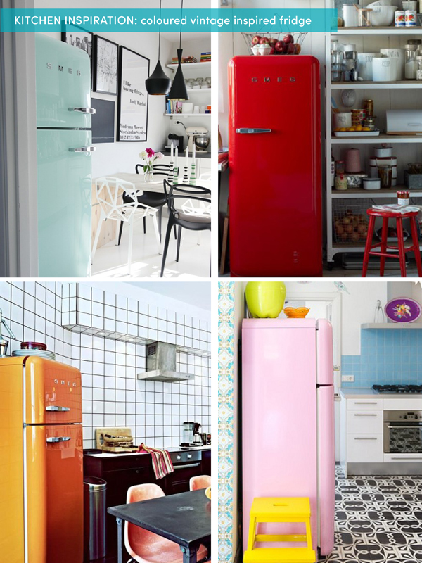
Definitely loving the vintage coloored fridge which is quickly becoming a trend (for the record, I’ve had my eye on one of these for 5 years) which hopefully means the prices may start to come down. Fingers crossed. The truth is I’m not sure if the kitchen can handle this coloor with everything else going on the in loft but it will be interesting to try it in a mock-up design. Maybe sticking with a black fridge is the answer, we’ll see.
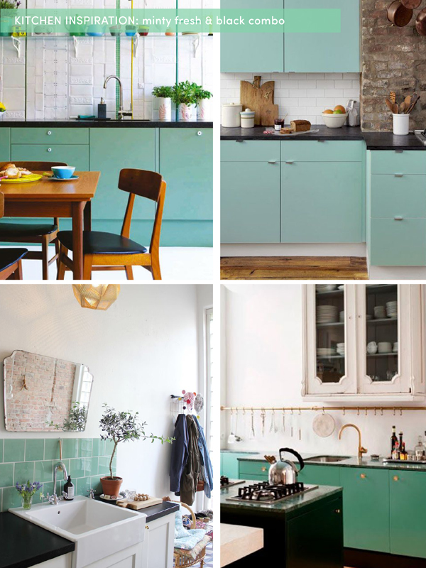
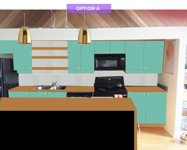
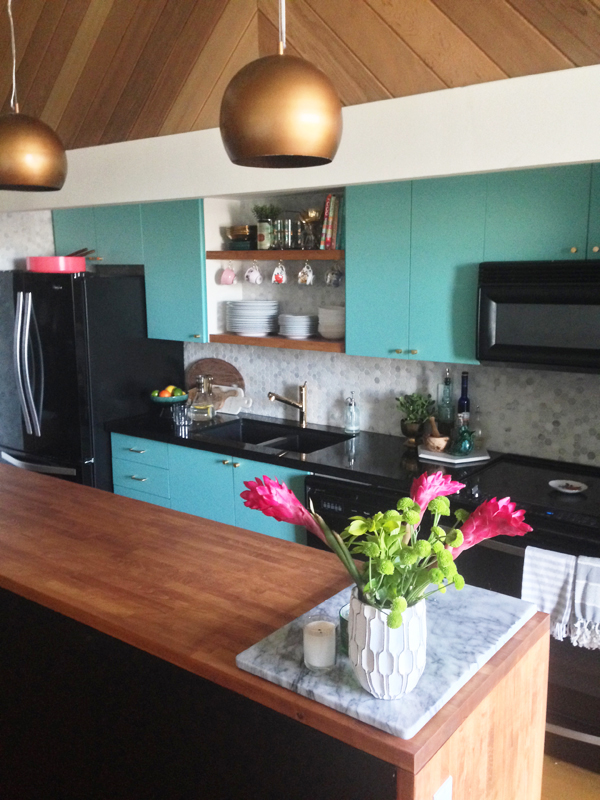
First thing first, the beach wood cupboards are dunzo. They are in fine condition and I have no intention of ripping them up but I would like to get them professionally spray painted and simplify the hardware. Maybe high gloss finish? I’m very drawn to this combo of black and minty green colour. What do you think? That’s pretty much my dining set in the first example which really helps me visualize.
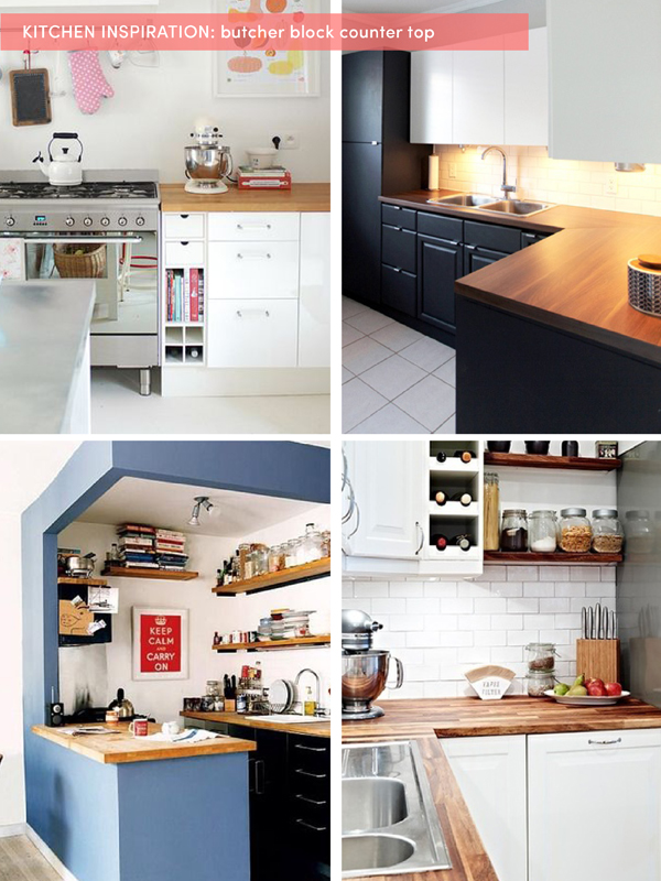
In my mind however, the counter is butcher block and I’m thinking that maybe the bottom cupboards are black and the top row in the minty green? Or maybe the cupboards green and just the island is black and the butcher block counter wrap around the sides (waterfall style)? I think a butcher block counter will really bring out the wood railing above the kitchen as well as the teak wood furniture that’s throughout the loft.
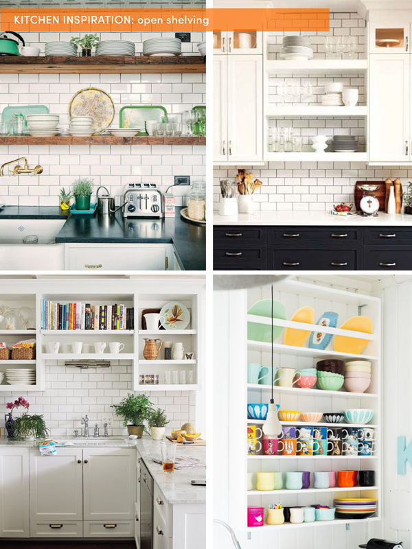
Then I’m thinking just a wee bit of open shelving because I know myself and I know I will never be able to maintain a beautiful looking full open shelf kitchen. But I’m thinking maybe the two large cupboards over the sink can become open shelving to showcase my white dishes as well as some of my favourite vintage kitchenware finds. And the shelves will be either wood, white or stainless steel with the backsplash tile coming up in the background. One of my friends has just had floating shelves made out of stainless steel from https://aluminiumwarehouse.co.uk. Stainless steel is a great material to incorporate into the kitchen as it is strong, looks modern, and even resists corrosion.
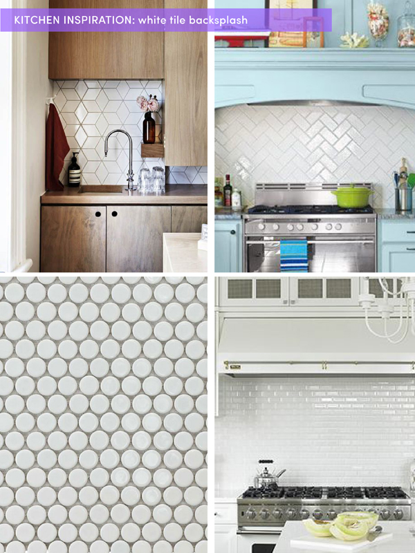
Right now the kitchen has no backsplash and I think it will just add a finished look. It makes sense to stick with a neutral & modern white option but I think it would be fun to explore a few different shapes and angles.
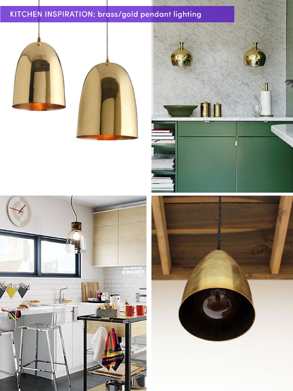
And lastly, that 90’s inspired frosted glass pendent that I have right now isn’t necessarily offensive but I think that updating it with a couple gold/brass pendants will make the kitchen look so much richer, especially against that great chevron wood railing detail.
Well there you have it folks. A little insight into the kitchen makeover file in my brain…oh yeah, which also happens to live on Pinterest.
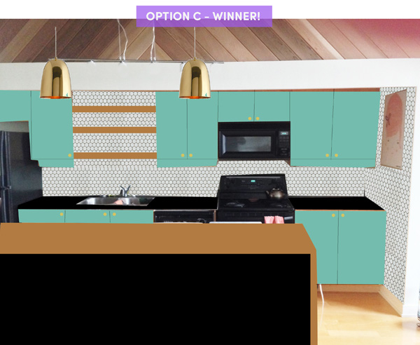
So I may be a graphic designer but I’m not an interior designer with all those fancy 3D model software but here’s my rough mock ups of the two slightly different versions from my above inspiration. I think I’ve decided that a black fridge may be best. But it can still be one of those fancy vintage looking ones.
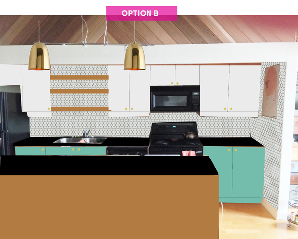
 For Option B, imagine that the cupboards are colour matched exactly to the wall colour, which are a tad more creamy than pure white. Also I thought it could be cool if the tile comes right up the side wall for this option.
I’m lucky to have so many talented and creative readers and I would love to hear your vote, your feedback, any advice from your own kitchen reno, good bargain hunting tips, tradesmen recos etc. Bring ’em on!
* UPDATE * I’ve since created an option C which I think is the winner. It’s a little bit of A and a little bit of B.
(PS: if you’re a brand, vendor, home decor publication or tradesman and interested in being part of this project in any way, please let me know!)
7 responses to “SPACES: my kitchen makeover inspiration”
Oh damn this is exciting! I have to vote for Option A. Option B with the black, the blue, the wood, and the cream is a little too many finishes for me. I think 3 is the max. I love love love chevron backsplash & I do love the idea of bringing it up the side wall also. The geo print is ah-mazing but maybe a little too trendy vs. classic? And let’s be honest, you gotta get that fridge! Waterfall butcher block all the way. WOW. I cannot wait to see this progress!!!
Hi Melissa!!!
Just discovered your blog, I really like it! I’m mad about DIYs and I’m a DIY-er, too ;)
Love your projects!
I would recommend the option A which is more colorful than the B :) and the vintage fridges like the SMEG ones, they are sooo pretty!
xx
Novella
http://9lla.it/
A fashion & DIY blog…
Thanks so much for stopping by Novella! and I’m with you on option A but I think we’re the minority.
NOPE–not the minority anymore, Option A allll the way! I would also consider a colorful appliance somewhere… Not sure where or what but a small one to the side, a toaster oven in teal? If I find a photo of what I mean, I’ll be back! I have linked my personal blog but I also suggest going through my design blog or Pinterest boards… Design blog: J9sOpinion.tumblr.com “Designed Opinions” for inspiration check the Archives. Pinterest check all boards to do with home/design/architecture: Pinterest.com/jeaniney25/ ;D All photos have designer credit, maybe you’ll find someone with more advice! Jeanine! Happy to have found your space through Craft Gawker App
Option B! Just to be difficult. I think A is turquoise overkill.
K i gotta go with B… buuuut maybe with one less finish, so either white shelves and white waterfall on the island? Orrrr… all butcher block on option B instead of the dark countertops, but that might be a lotta wood! Either way you’ll end up with something amazing, I’m sure!
Both are nice (LOVE aqua, wood and white in kitchens) but Option B is my fav! Can’t wait to see the progress and finished product one day!