If you follow me on Instagram you may have seen that I recently put up some new wallpaper. The thing is that I’ve been getting the itch to change things up around the loft and the orange wall was on the top of my list. Don’t get me wrong, I think it looks great and I love that it will forever be featured in Covet Garden Home but after 5.5 years of living in my space, a creative gal like me gets the itch for change. You also probably can tell that I’m a HUGE colour lover. Well the world is not ending but believe it or not I want to tone down the colour in my loft ever so slightly. Trust me, there’s still plenty of colour to go around but I want to make a few changes in the more neutral direction. First up was getting rid of my bright blue desk (which I have yet to blog about….bad blogger) and now it’s the big orange wall. So I was always thinking of going to black range of colour. I know a) black isn’t really a colour and b) that’s shocking for me.
Of course I couldn’t find the exact pattern that I had made up in my head. Apparently wallpaper designers can’t read my mind or I have horrible taste, who knows. But I did find this great dotted wallpaper, Kiss Kiss By Marimekko from New Wall. I love that it’s a great balance of sophisticated & classy black but the fun of the irregular white dots.
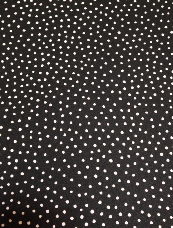
But before everyone gets too excited like me, there’s that pesky task of removing the old wallpaper. Yeah that. Well I’m happy to say that the orange wallpaper came off wayyyyyyyyy easier than I anticipated. It kinda just peeled off. And no, I didn’t prime the wall before putting up new wallpaper. Sue me. And yes, sometimes I do work like this in a skirt because you never know when the mood will hit you and you just go with it.
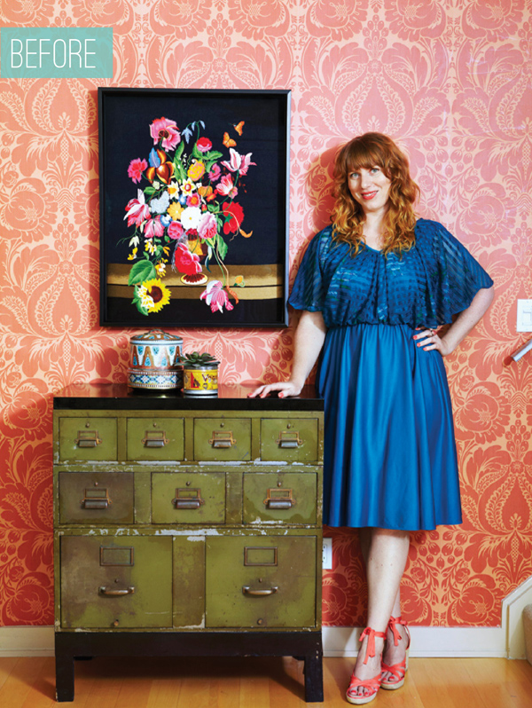
It’s a bit sad to see it all just laying there in a pile isn’t it? Just as a reminder, here’s what it looked like before I tackled it. This is the great shot from my Covet Garden Home feature. No my hair doesn’t look that great every day (see above).
…..and then the after! Now, don’t judge my photography compared to Maya’s beautiful pro photo above but I think you get the idea. The density of the dots gives the wallpaper almost more of a grey look so it’s not super dark and harsh. I also love that the irregularity of the dots are still fun & playful and don’t make a rigid pattern. The colours of the embroidery art and accessories still pop and look amazing.
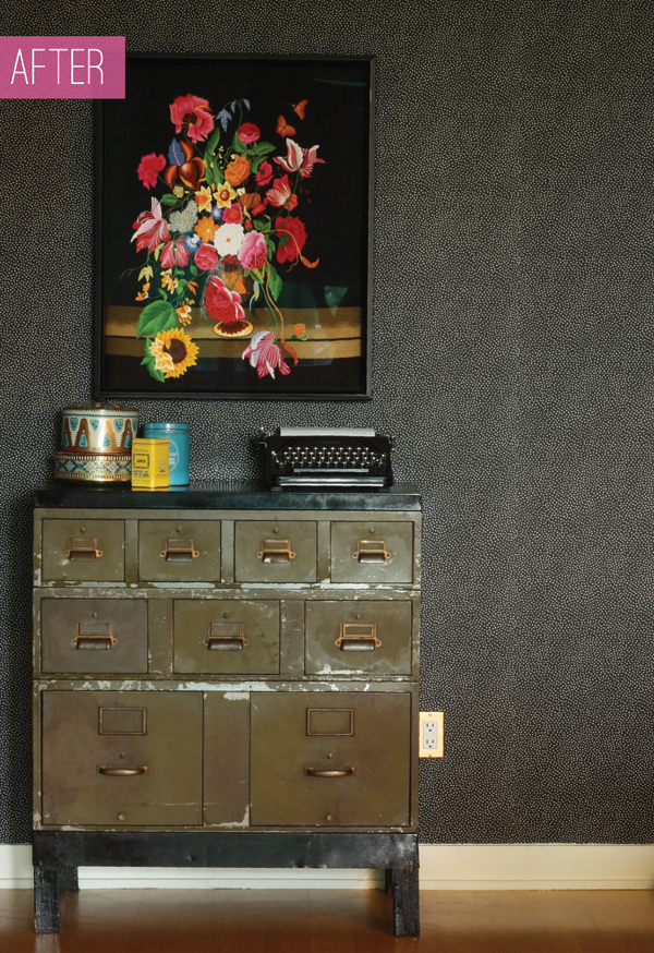
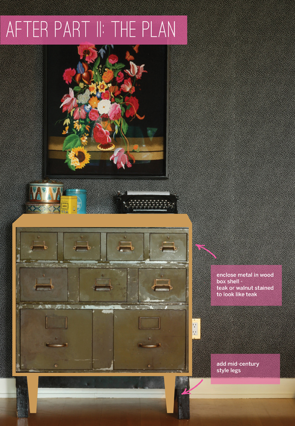
The metal drawers, however, look ok but they definitely don’t pop as much. I’ve had a plan in mind for these drawers from the day I brought them home and looking at them against this wallpaper every day has finally given me the push I need to make the project happen. I have this look that I made up in my head and I think it will make this piece look even more unique and just more polished. Let me know if you agree. Basically I want to enclose the drawers in a nicely finished wood shell and add some mid-century legs. What do you think?
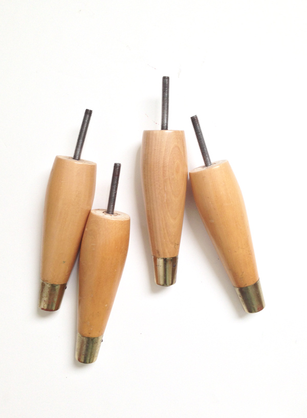
I found these great mid-century legs at a Goodwill and snatched them up with this project in mind. Yay for thrifting & recycling! I will likely stain them a colour to match the box but the shape and metal detail is great. You know that area of a thrift store that has totally random stuff that doesn’t belong anywhere hanging in bags on a wall? Yup, that’s where you find stuff like this.
I would love to hear your feedback on the wall and Part II of the makeover plan. Also, let me know if you have suggestions of where I could get the wood shell made in the Toronto area. Stay tuned for the results!

10 responses to “BEFORE & AFTER: a wallpaper makeover”
Love this – it reminds me of guinea fowl feathers. Really makes the artwork pop too! I have the inverse print on a huge lumbar pillow on my bed in Kelly Wearstler’s Confetti.
Yes, I’m loving it. YOurs sounds pretty great too.
That transformation is insane! I just love the black with white dots wallpaper. And you are courageous for going through all that painstaking work. We just removed wallpaper from our dining room and I swear I will never put any up in our house ever ever ever. Mind you, I’m sure modern day wallpaper is much better than the 40 year old crap on our dining room walls.
Loved finally meeting you at Alt Melissa! I will certainly let you know if I come over to Toronto
xo
As much as I would love to take credit for all the hard work, I’ll be honest, the orange paper just came right off. It was soooooo satisfying – which is why once I started I couldn’t stop, even wearing my skirt..ha!
It was great to meet you too! and I really enjoyed your panel. Please come spread your words of wisdom at BlogPodium in September :)
Hey, my last name is Kiss…so how can I not love Kiss Kiss wallpaper by Marimekko? :) Looks fabulous!
Really!? You have to get it!
Oooo love the makeover! The dots are super playful and completely change the tone of the room. Can’t wait to see what you do with part II– your plan looks wonderful!
thanks! Now, I just need find someone (read: a man) to help me with part 2
Thanks girl! Yes, I just need to find someone to make Part II for me.
Wow! Looks great! And I love that you DIY wallpaper in a skirt!